




Reniva moderne pendellampe i glas
Beskrivelse
Inspiration
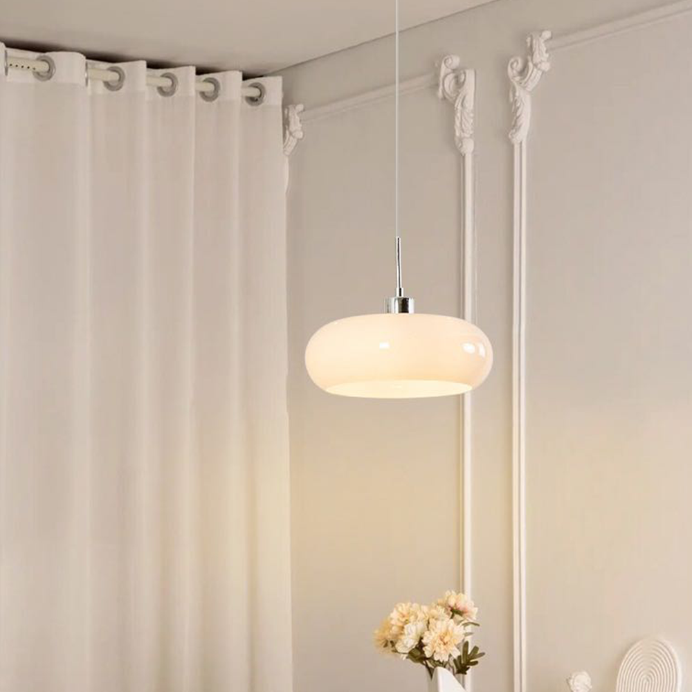
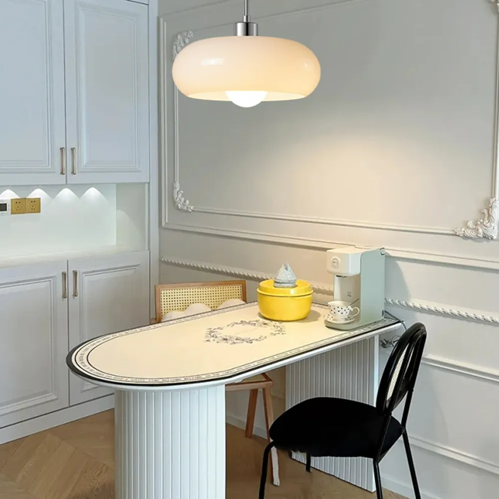
Denne pendellampe leveres med monteringstilbehør og har et justerbart design, der gør den nem at installere og egnet til at skabe den rette stemning. Den fås i livlig orange eller ren hvid, og den charmerende, kuppelformede glasskærm lyser ethvert rum op og tilfører en moderne og varm atmosfære.

| Produktdetaljer | |
| Type | Pendellampe |
| Stil | Charlotte |
| Anbefalet anvendelse | Stue/soveværelse |
| Anbefalet rumstørrelse | 5㎡-10㎡ |
| Indendørs eller udendørs brug | Indendørs |
| Trinløs dæmpbar | Nej |
| Farvetemperatur | Varm hvid |
| Smart-funktion | / |
| Kræver montering | Ja |
| IP-klassificering | IP20 |
| Strømkilde | Fast tilslutning |
| Lyskilde | |
| Pære inkluderet | Ja |
| Pæretype | LED |
| Pæresokkel | E27 |
| Antal pærer | 1 |
| Spænding (V) | 110V-240V |
| Maksimal wattstyrke(W) | / |
| Materiale | |
| Primært materiale | Metal+glas |
| Armaturets materiale | Metal |
| Lampeskærmens materiale | Glas |
| Mål | |
| Produktvægt | / |
| Justerbar kæde/ledning | Ja |
| Størrelse | Se billeder |
| Pakkens indhold | |
| 1* Pendellampe | |
| Bemærk | |
| Størrelsen er målt manuelt, så der kan forekomme en afvigelse på 1-3 cm. På grund af forskelle i belysningen kan der forekomme mindre farveafvigelser. Vi takker på forhånd for din forståelse. Vi anbefaler, at du får en professionel elektriker til at installere den | |
Inspiration
Denne pendellampe leveres med monteringstilbehør og har et justerbart design, der gør den nem at installere og egnet til at skabe den rette stemning. Den fås i livlig orange eller ren hvid, og den charmerende, kuppelformede glasskærm lyser ethvert rum op og tilfører en moderne og varm atmosfære.
| Produktdetaljer | |
| Type | Pendellampe |
| Stil | Charlotte |
| Anbefalet anvendelse | Stue/soveværelse |
| Anbefalet rumstørrelse | 5㎡-10㎡ |
| Indendørs eller udendørs brug | Indendørs |
| Trinløs dæmpbar | Nej |
| Farvetemperatur | Varm hvid |
| Smart-funktion | / |
| Kræver montering | Ja |
| IP-klassificering | IP20 |
| Strømkilde | Fast tilslutning |
| Lyskilde | |
| Pære inkluderet | Ja |
| Pæretype | LED |
| Pæresokkel | E27 |
| Antal pærer | 1 |
| Spænding (V) | 110V-240V |
| Maksimal wattstyrke(W) | / |
| Materiale | |
| Primært materiale | Metal+glas |
| Armaturets materiale | Metal |
| Lampeskærmens materiale | Glas |
| Mål | |
| Produktvægt | / |
| Justerbar kæde/ledning | Ja |
| Størrelse | Se billeder |
| Pakkens indhold | |
| 1* Pendellampe | |
| Bemærk | |
| Størrelsen er målt manuelt, så der kan forekomme en afvigelse på 1-3 cm. På grund af forskelle i belysningen kan der forekomme mindre farveafvigelser. Vi takker på forhånd for din forståelse. Vi anbefaler, at du får en professionel elektriker til at installere den | |
Sikker betaling
Sikker betaling, vi accepterer i øjeblikket større kreditkort (VISA, Mastercard, AMEX osv.) og PayPal. Beskyttet med avanceret SSL-krypteringsteknologi, der giver et pålideligt værn til beskyttelse af dine følsomme personlige og økonomiske oplysninger.
Sikker betaling, vi accepterer i øjeblikket større kreditkort (VISA, Mastercard, AMEX osv.) og PayPal. Beskyttet med avanceret SSL-krypteringsteknologi, der giver et pålideligt værn til beskyttelse af dine følsomme personlige og økonomiske oplysninger.
Returpolitik
Ved levering af varerne skal du straks undersøge dem. Hvis nogle af de bestilte varer er blevet beskadiget under transporten, er blevet sendt forkert, ikke opfylder dine krav eller er defekte på grund af fejl i materialer eller fabriksforarbejdning, bedes du underrette os skriftligt via e-mail på contact@cielum.se senest 30 dage fra leveringsdatoen for de pågældende varer.
Ved levering af varerne skal du straks undersøge dem. Hvis nogle af de bestilte varer er blevet beskadiget under transporten, er blevet sendt forkert, ikke opfylder dine krav eller er defekte på grund af fejl i materialer eller fabriksforarbejdning, bedes du underrette os skriftligt via e-mail på contact@cielum.se senest 30 dage fra leveringsdatoen for de pågældende varer.
Viden om lamper
*En generel forklaring på produktegenskaber for alle lamper. Det betyder ikke nødvendigvis, at produktet på den aktuelle side er trinløs dæmpbart eller kan skifte mellem tre farver.
Se beskrivelsen for at finde ud af, om det aktuelle produkt er trinløs dæmpbart.
- Trinløs dæmpbar version: Leveres med en fjernbetjening, som kan bruges til at justere lysets lysstyrke og farvetemperatur. Den er ikke kompatibel med lysdæmpere.
- Triac-dæmpbar (styres med vægkontakt): Kompatibel med de fleste standard LED-vægdæmpere med tyristor (Triac) (medfølger ikke). Denne version giver dig mulighed for at justere lysstyrken via din eksisterende vægkontakt, men der medfølger ikke en fjernbetjening.
- Version med tre farver, der skiftes med kontakten: Styres med en almindelig vægkontakt (medfølger ikke), så du kan justere lysets farvetemperatur. Denne version har ingen hukommelsesfunktion. Hver gang lampen tændes, nulstilles den til standardindstillingen.
Bemærkning om måltolerance:
Alle mål er målt manuelt. På grund af visse lampers særlige form eller håndværksmæssige udførelse kan en afvigelse på 1-3cm forekomme inden for normalområdet. Se det modtagne produkt for præcise mål ved montering.
Bemærkning om farver:
De faktiske farver kan variere en smule på grund af forskellige skærmindstillinger, rummets omgivende lys eller de anvendte pærers farvetemperatur. Tak for din forståelse.
